In October 2023, the company decided to update its corporate and visual identity after 6 years with the same logo and corporate colors.
After months of meticulous work and strategic planning, we are delighted to introduce our refreshed look, which reflects our ongoing evolution and solid commitment to excellence in the field of generic medicine.
Our new design represents our dedication to innovation, quality, and progress. With a fresh and modern approach, this visual transformation reflects our forward-thinking vision.
Our name
We have decided to retain the company’s current name.
The name “WinMed Nordic” summarizes the essence and focus of our pharmaceutical company specializing in the distribution of generic drugs. “Win” represents our commitment to success and excellence, while “Med” is derived from “medicines,” emphasizing our fundamental dedication to health and wellness through pharmaceutical solutions. “Nordic” reflects our strong presence and expertise in the Nordic pharmaceutical market. Together, “WinMed Nordic” communicates our mission to improve healthcare accessibility and quality by delivering high-quality pharmaceuticals through innovative, efficient, and sustainable distribution solutions.
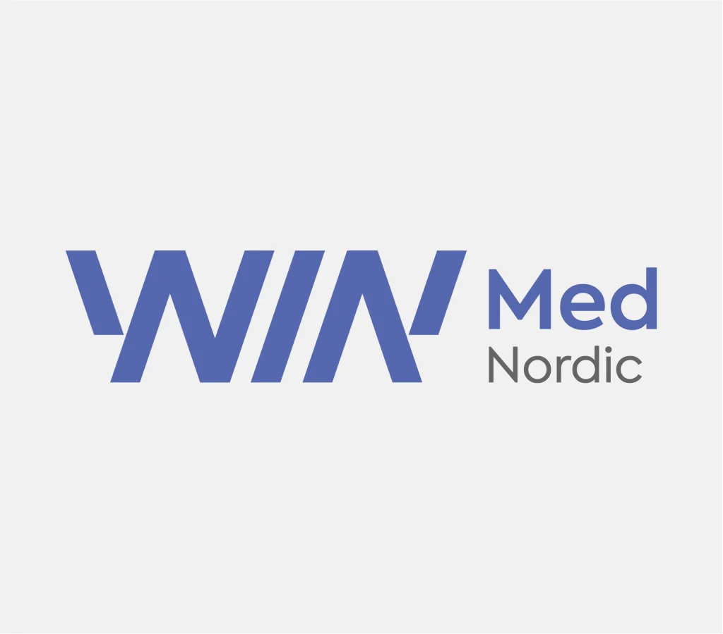
Our logotype
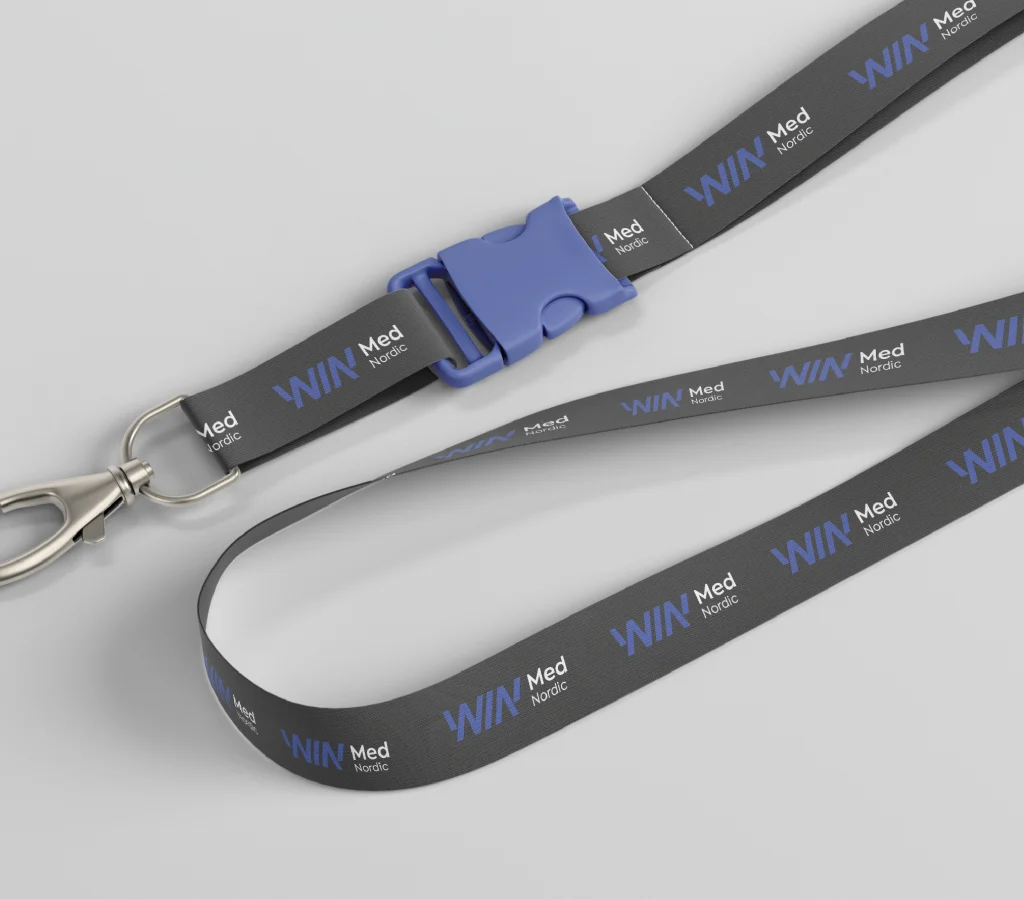
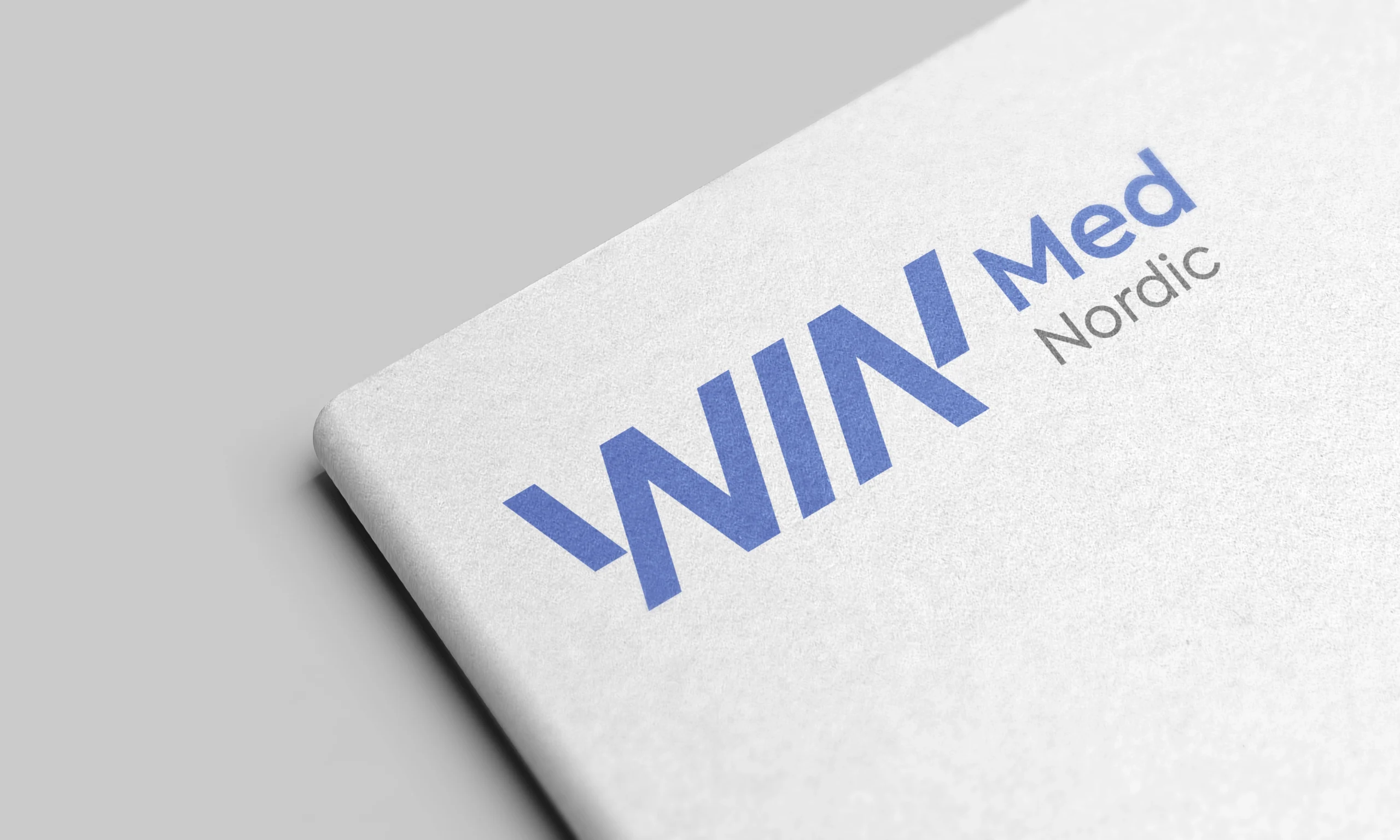
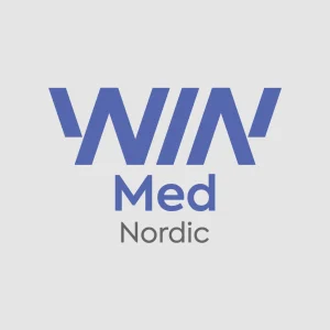
As for the company logo, we have ensured that the logotype structure remains consistent with our partner companies, WinMed Spain and GxMed, to maintain brand cohesion across our network
This typeface presents a geometric structure and a minimalist design, granting a professional and clean look for the brand.
To improve the legibility and highlight keywords like “WIN” and “Med,” we have introduced a differentiation between bold and light typography.
Additionally, we have unified the “W” and “M” elements within the logo to achieve a cohesive look and feel.
Furthermore, we have made slight adjustments to the colors to refresh the overall aesthetic while maintaining brand continuity.
Our colors
After careful consideration, we have opted to maintain our current colors while making slight adjustments to their tonality to uphold the WinMed Nordic identity.
BLUE – Trust, Reliability, Innovation, Stability
Blue is now our primary corporate color, symbolizing trust, reliability, and innovation. It represents WinMed Nordic’s commitment to providing high-quality pharmaceutical solutions with a strong foundation in stability and progress.
GRAY – Professionalism, Neutrality, Stability, Sophistication
Our second primary corporate color is gray, chosen for its association with professionalism and stability. It emphasizes WinMed Nordic’s commitment to reliability and excellence in the medical industry.
WHITE – Purity, Cleanliness, Simplicity, Transparency
BLACK – Elegance, Authority, Expertise, Sophistication
Black and white represent our secondary colors, which appear in our corporate applications to symbolize our key values such as quality and reliability.
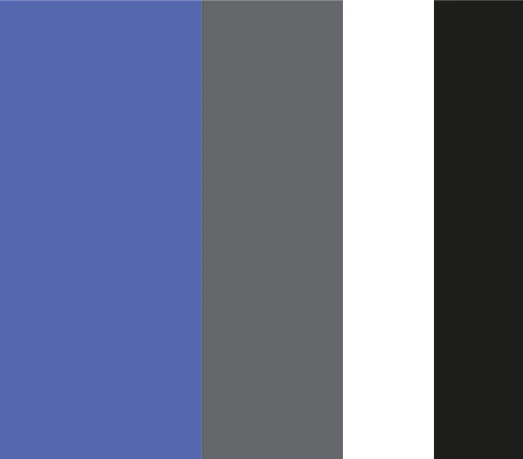
By emphasizing these attributes, we aim to illustrate how WinMed Nordic’s corporate colors have become more than an aesthetic choice: they communicate our core values and identity in a comprehensive manner while also evoking the essence of the Nordic countries, reinforcing our regional presence and commitment.